| yksehtniycul
|
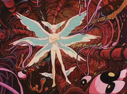 don't play with me 'cause you're playing with fire
 |
Yeah... I think I knew the one in advance (though I don't think I've seen it personally in a game)
I just thought it was funny to point out it was eerily similar 
|
Logged yksehtniycul has 2094 Posts (+0/-0 Karma) |
|
|
| yksehtniycul
|
 don't play with me 'cause you're playing with fire
 |
How does this strike everyone as a new site banner? 
Another thing to bear in mind while crafting banners... is asap the banner will have to be expandable horizontally to accommodate a wider page. Also the current banner height is just based on the default Wordpress theme. So we could change that at this point if we wanted to.
At any rate, basically the final banner will be at least three images. One for the graphic, another for the expandable background, and another for the font, which will float in from the left.
I recommend for your banner there a serif font to match the seal at minimum.
PS: The page avatar will float and overlap the banner somewhat.
« Last Edit: October 10, 2008, 01:01:34 PM by yksehtniycul »
|
Logged yksehtniycul has 2094 Posts (+0/-0 Karma) |
|
|
| DevilRy
|
 Being the most important can't be seen in the eyes
 |
Just a preliminary effort to see what to put up in lieu of the current banner. I just don't have the same level of confidence in it as you do I guess...
I was thinking about how maybe using different banners for the varying series might be a good idea. I don't know how minimalist of an approach you're going for though.
The font on the tetragrammaton does have serifs, they're just not as visible since it's so small. I debated on the placement of it for a while although I must admit I'm not sure how well it jives with the banner. If anything it kinda covers up some of neater details over in the corner. Regardless, the only letters that actually *have* serifs in the DIGITAL DEVIL DATABASE font are the Is.
My thoughts were that it makes more sense to use an image like that one to focus on the "devil" aspect of the title of the website. I mean "boy-girl-kerberos," isn't really self-explanatory to the uninitiated. A Devil-Database to me evokes imagery of swarms of demons and I think is more fitting with the content on the whole of the site.
|
Logged DevilRy has 435 Posts (+23/-0 Karma) |
|
|
| yksehtniycul
|
 don't play with me 'cause you're playing with fire
 |
I meant the DIGITAL DEVIL DATABASE should be serifed like the fonts in the seal (the underscores are not necessary btw -- and many serif fonts serif just about every letter afaik)
I think my idea of a pixelated font is probably closer to what you'd get by taking a normal font and running some cheesy pixelate filter over it. But at any rate, that is for v2.0 or v3 (however you wanna think about it) after the dust settles and a long vacation....
I don't think the name means it's actually a Devil Database. It's just a play on the millions of other four letter acronym DB sites out there that try to encompass everything on a particular subject. If anything the Digital Devil part harkens back to the original titles.
My biggest deal is I think if there's gonna be one Megaten database to rule them all, it's gotta be pretty scientific and objective about the way it operates. That means not paying more service to any particular strain of Megaten for example. So the easiest way to be true to roots is to reach back as far as possible.
You know, if SMT is the New Testament, where does that leave the "Jewish" Megateners. It's easier to just use what is common as the basis for everything else. And not only that, I think the core elements of Megaten are powerful. A boy a girl and his dog out to slay god. Really what else is there??
On the other hand I'm all for revolving banners (I'm not for section specific banners) ...but for that we need a handful of banners to get started. For instance, if you do a fallen angel banner like that, it basically implies in fairness you need an angel banner too. At any rate, I'll probably only do the one banner. So it'll be up to the self appointed art dept to bang out more. I like sticking with the duotone blue on white look for now however. I don't think we need to swap out the banner just yet. But if you wanna make a collection of banners, I suggest you focus more on the imagery and less on mocking up the actual banners. Cause like I said, the html for the banners will be a bit complicated.
« Last Edit: October 10, 2008, 04:34:55 PM by yksehtniycul »
|
Logged yksehtniycul has 2094 Posts (+0/-0 Karma) |
|
|
| yksehtniycul
|
 don't play with me 'cause you're playing with fire
 |
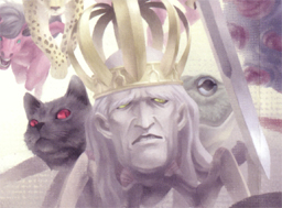
Here is a more interesting take on Snakeman I just grabbed while watching an in-game movie...
|
Logged yksehtniycul has 2094 Posts (+0/-0 Karma) |
|
|
| DevilRy
|
 Being the most important can't be seen in the eyes
 |
I meant the DIGITAL DEVIL DATABASE should be serifed like the fonts in the seal (the underscores are not necessary btw -- and many serif fonts serif just about every letter afaik)
I think my idea of a pixelated font is probably closer to what you'd get by taking a normal font and running some cheesy pixelate filter over it. But at any rate, that is for v2.0 or v3 (however you wanna think about it) after the dust settles and a long vacation....
I don't think the name means it's actually a Devil Database. It's just a play on the millions of other four letter acronym DB sites out there that try to encompass everything on a particular subject. If anything the Digital Devil part harkens back to the original titles.
My biggest deal is I think if there's gonna be one Megaten database to rule them all, it's gotta be pretty scientific and objective about the way it operates. That means not paying more service to any particular strain of Megaten for example. So the easiest way to be true to roots is to reach back as far as possible.
Well, that was the intention. That and to highlight the consistent elements of the Megaten that have been there since the beginning - the devils, which are a lot more interesting than the mains IMO.
You know, if SMT is the New Testament, where does that leave the "Jewish" Megateners. It's easier to just use what is common as the basis for everything else. And not only that, I think the core elements of Megaten are powerful. A boy a girl and his dog out to slay god. Really what else is there??
Another reason to highlight the demons rather than one testament over another. 
On the other hand I'm all for revolving banners (I'm not for section specific banners) ...but for that we need a handful of banners to get started. For instance, if you do a fallen angel banner like that, it basically implies in fairness you need an angel banner too. At any rate, I'll probably only do the one banner. So it'll be up to the self appointed art dept to bang out more. I like sticking with the duotone blue on white look for now however. I don't think we need to swap out the banner just yet. But if you wanna make a collection of banners, I suggest you focus more on the imagery and less on mocking up the actual banners. Cause like I said, the html for the banners will be a bit complicated.
I'm just messing around with fonts, seeing what I think works and what doesn't. I'm all for the gradient look of the banner I'm just more concerned with choice of imagery.
|
Logged DevilRy has 435 Posts (+23/-0 Karma) |
|
|
| yksehtniycul
|
 don't play with me 'cause you're playing with fire
 |
You don't actually have to use a gradient. You can have a texture effect, but in one direction it basically has to trail off into noise so the side of the banner where the graphic ends doesn't cut off something important. Technically I can pull that off by just layering the rounded corners over the top of the banners I think.
As for the devils, they are so ubiquitous they kinda lack charisma, though I like all those horde graphics. When done ok they kinda make up for it. Still I think that is more of a rotating banner thing. I just feel more comfortable using the older stuff for the top banner. It just happens some of the few artwork that is sophisticated enough is from the anime and possibly the novel artwork, which I've yet to plumb.
« Last Edit: October 10, 2008, 08:12:44 PM by yksehtniycul »
|
Logged yksehtniycul has 2094 Posts (+0/-0 Karma) |
|
|
|
|
Awesome scans!! 
Signature under construction 'cause the last one died.
|
Logged Emilio Morales has 1133 Posts (+25/-0 Karma) |
|
|
| yksehtniycul
|
 don't play with me 'cause you're playing with fire
 |
I have a feeling we should definitely work "Megami Tensei" somehow into a subtitle alongside the title in logos.
|
Logged yksehtniycul has 2094 Posts (+0/-0 Karma) |
|
|
| yksehtniycul
|
 don't play with me 'cause you're playing with fire
 |
Another Manga like piece....

|
Logged yksehtniycul has 2094 Posts (+0/-0 Karma) |
|
|
|
|
| yksehtniycul
|
 don't play with me 'cause you're playing with fire
 |
So any Saga alternatives in the pipeline?
|
Logged yksehtniycul has 2094 Posts (+0/-0 Karma) |
|
|
| DevilRy
|
 Being the most important can't be seen in the eyes
 |
For DDS News:
|
Logged DevilRy has 435 Posts (+23/-0 Karma) |
|
|
| yksehtniycul
|
 don't play with me 'cause you're playing with fire
 |
For DDS News:
Thanks, but please keep trying 
That image isn't high enough quality anyways, but whoever that chick is, she isn't doing it for me 
PS: These aren't really news avatars as much as page avatars (to add some colour / remind you what you're looking at)
Hopefully we'll be able to work them into post icons as well.
« Last Edit: October 15, 2008, 12:48:07 AM by yksehtniycul »
|
Logged yksehtniycul has 2094 Posts (+0/-0 Karma) |
|
|
|

