DIGITAL_DEVIL_DATABASE Community Forum
April 26, 2024, 10:06:46 AM
Welcome, Guest. Please login or register.

Login with username, password and session length

News: 2011: http://www.digitaldevildb.com/bbs/index.php/topic,1031.msg10894.html
 
  Home Help Search Calendar Login Register  
  Show Posts
Pages: 1 2 3 4 5 6 7 8 9 [10] 11 12 13 14 15 16 17 18 19 20 ... 30
136  Be Your True Mind / The Turnstile / Re: Cool Clock... on: October 14, 2008, 09:20:49 PM
Like the clock, the article though is a bit wackadoo for my tastes.
137  Be Your True Mind / The Turnstile / Re: The Original Devil Dictionary on: October 14, 2008, 09:19:53 PM
Yeah, some of them are just out-right copies.  I don't think this loses Kaneko any talent points but taking one off for lack of creativity at least.  frown
138  Post Apocalyptic Hellscape / The Underground / Re: Tony and the graphics situation?? on: October 13, 2008, 08:18:38 PM
Quote
I have a problem with your attitude and personal language.

Wouldn't that be taking what I'm saying personally?   geno 

Quote
I don't think there are very many suitable images of Kerberos (imo)

I don't think Kazuma's general take on Kerberos is suitable for a banner. It just doesn't work as an icon. You know, like something that would look acceptable on a tshirt (a really nerdy tshirt)

Yeah, I don't think there are that many drawn images of Kerberos at all really.  I think there are two Kaneko illos, one for Kyuuyaku or Shin Megami Tensei and another in the Kaneko III book.

Quote
If people don't play it, that is there loss. And it doesn't mean fans shouldn't be made aware. Traci might want ftp access if she helps, but of course, the second things turn into an ftp war I'm out (which would be a loss considering my professional know-how)

I don't think anyone else is qualified to program a custom demonary database, so everyone better be nice to me cool

I just think it's divisive and exclusionary to use original Megaten iconography when the majority of our site visitors couldn't possibly be familiar with it.  It doesn't mean that fans shouldn't be made aware of the original games, it just not an association the majority of our site visitors will recognize.

Quote
I think content is more important than window dressing. I'm more of a fan of the Japanese internet esthetic. High gloss is for the birds. I would never organize a personal website this way graphically.

Well they're both important but the graphic element is the candy that keeps people coming.

Quote
I think the whole page loads up. The page as a whole is more important than any single part. That is design 101.

Of course, but that's not what I'm saying at all.

Quote
Quote from: DevilRy
What do I deserve a warning for?   confused

Being uppedy.

Um... you can't be serious.  face15

Quote
If you can't argue your point on technical grounds, then don't.

I am arguing on technical grounds...

Quote
You could be much more objective.

So can just about everyone, yourself included.

Quote
The "citizens" can wait for cooler heads to prevail.

You keep thinking that I'm mad or something for some reason.  I don't know what I've said during the course of this discussion that would cause you to draw such a conclusion.

Quote
I missed this last post before. I don't have time for all these quotes, so enough is enough sweatdrop

At this point I'm only responding because you are.  That and you haven't really addressed any of my points as to why I think a "devils"-based concept is better for a site banner versus a Kerberos/O.G. Megaten one.  Seriously it's not a big issue I'm just concerned that we don't seem to be on the same page.
139  Be Your True Mind / The Turnstile / Re: The Original Devil Dictionary on: October 13, 2008, 04:23:03 PM
You're welcome.  smile

Eventually I plan on picking them out of that PDF but I'm looking around for better quality and larger images if I can.

The end is the English translation of the Dictionnaire Infernal.  The numbers correspond to the plates and generally just describe the demon and its purported abilities/affinities.  Some of the plates aren't demons though, just scenes or rituals.

As for migrating pages... I don't really know how to even begin doing that.  frown
140  MEGAMI TENSEI™ Uncensored / Nirvana / Re: DDS 2 Secret Bosses on: October 13, 2008, 04:17:09 PM
Wow...  eek  This is what I get for playing through games several years after their release.   Personally I'm not sure how kids these days plow through RPGs so fast.  goodnight

Anyway, I beat Vishnu and Seth, both were A LOT easier than Shiva, mostly because of the Press Ring (it makes the whole game super easy even on a Hard cycle) and the fact that Seth has a weakness to bullets.  Seraph is in the lead on the Karma front at Level 84 I believe. 

I went ahead and fought Satan just to see what he's like, of course he insta-killed me on the fourth (or fifth?) round, but I was just trying to gauge out his pattern, see what I could get away with.  Since he cancels out your auto-immune skills right at the beginning, Seraph and Cielo are obvious choices since they lack an elemental weakness.  So I'm going with Gale (mostly because he has more Mantra mastered than Argilla and all-around better defense), but his weakness to Jio makes him the weakest link in the bunch.  Whenever I get around to it I'm going to test out to see if the Dengeki Stronger ability will work in this fight to cancel out his weakness.

I'm not looking forward to leveling up more than ten Karma just fighting enemies though...  The only bosses left are Satan and Brahma so I don't really have much of a choice except to tool around the Sun for quite a while....  frown
141  Post Apocalyptic Hellscape / The Underground / Re: Tony and the graphics situation?? on: October 13, 2008, 04:29:28 AM
Is that YHVH btw? Don't think so?? nolaff

Nope, it's not YHVH, I can't remember the name of that demon right now, but is one of those that hides in the ground and come up when they attack and they have wings in their heads.

http://www.dokuganryu.com/scans/megaten/comickers/03.jpg

Missed this somehow...  But a quick response before I pass out for the night.  goodnight

The big-head guy is, funny enough, Abaddon:
http://www.dokuganryu.com/scans/megaten/kanekoIII/513.jpg

who has an evil twin, Alsiel:
http://www.dokuganryu.com/scans/megaten/kanekoIII/512.jpg
142  Be Your True Mind / The Turnstile / Re: Megaten Seal of Solomon on: October 13, 2008, 03:25:46 AM
Here's a fairly good one, high-res at least:
143  Be Your True Mind / The Turnstile / The Original Devil Dictionary on: October 13, 2008, 03:19:17 AM
http://www.lucifer.tw/fantasy/artist/devil/pic/plancy.pdf

Louis Breton's original plates for the Dictionnaire Infernal, a French demonary based partly on Pseudomonarchia Daemonum.

This is basically the inspiration for a good chunk of the demons in SMT.  Some of them actually appear in the games almost identically as to how they are represented in this book.

Admittedly the scans aren't all that great but it is over 100 years old.
144  Post Apocalyptic Hellscape / Sea of Souls / Re: DevilRy - moderator on: October 13, 2008, 03:11:09 AM
Made site favicon:
145  Post Apocalyptic Hellscape / The Underground / Re: Tony and the graphics situation?? on: October 13, 2008, 02:55:18 AM
I don't take things personally, but you clearly appear to be doing so, and it's frustrating. Especially in public.

Not really.  I'm just presenting an alternative viewpoint vis-à-vis the site banner.  I really couldn't care either way.  Rather, it just seems like you think I'm being insulting because I disagree.

Quote
Do you mean in vain? aroused

Harhar.  sweatdrop  Think Carly Simon.  hearton  I kid, I kid.

Quote
I apologize. I didn't realize we'd gone so far as to the point this stuff was even worth caring about doh

I'm just trying to make the site work technically! Before it was (no offense to Tony) basically unmanageable and technically erroneous site. If it was better implemented I have a feeling Tony would not have felt so overburdened by it. Especially if he'd reached out more to the community for support.

Afaik, there is no aspect to the site that can be judged on esthetic grounds, other than the banner, and possibly some choices of language?? Which of course are open to discussion. Frankly I'm very close to shutting down my development of the site until others (I respect your support) choose to help support the site.

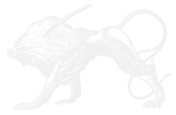
All I was really referring to was the banners (the forum banner as well).  Kerberos would be a pretty good site mascot though.  I'm just saying a good, eye-catching banner draws people to the site, as stupid as that sounds.  Good graphic design is like laying a trap for the senses.  I think that by implementing better graphic elements it'll draw a much larger crowd.  Basically be as inviting and as quick to the point as possible.  Something that has "Megami Tensei" written all over it without having to actually write it on the banner itself.

More power to you on the technical front btw.  I had a hard enough time just trying to navigate the damn Wordpress let alone manage a website with it.  eek

Quote
It's not about what I want. I might be the executive in most cases, but I'm not "The Decider."

Well you are in the strict-"I am the only one who can edit and code the website"-sense you really are.  I don't think it's about what I want either, I'm just trying to think from the viewpoint of the average English speaking person interested in Megaten, who, let's face it, will probably never play the original Digital Devil Monogatari (or II).

Quote
There's nothing to the site that reflects my own tastes. Tony's site must go for purely technical reasons, and I'm even happy to try to make the site look more or less like Tony's someday... once that becomes a technically viable option. I changed the site look, because it had to be, so I did the minimal I could muster to get the job done. If you're unhappy with it, keep working at it.

Well that's my plan, in my free time at least.  We're going to need more than a minimal effort though if we plan to get more people on the site.  It's just generally congruous logic to say that if we pick up on the design aspect we'll end up drawing more folks in.  I think we can definitely glamorize the site up a bit without making it a clusterfuck. 

Quote
These statements are totally inaccurate. Besides the fact, I think you're giving to much creedence to the significance of the site banner. A good banner I think should be quite subtle. It will appear on every page. Again these are just my feelings, not my decree. Like I've always said, your banner was fine... though I apologize if you expected it to jump straight from your post onto the front page. I believe in the slow wisdom of bureaucracy, and if something isn't technically broken, what's the rush to fix it? The second things start changing around here too fast, it really will look like a tyranny.

Well I really *wasn't* expecting it to go up, at least not forever, but I feel it looks a might better than the current one.  I disagree with you on the importance of the site banner though.  I mean it's the first thing that pops up in your browser and with today's highly visual interfaces I think you can't really stress the importance enough, especially if we're trying to attract the community.

Quote
You're obviously on about something. All I ask is you find an appropriate font and give it some more thought. I frankly could care less about a banner. And I don't think the banner I threw up there is the bee's knees. It's important to discuss matters, but if we can't do it without behaving like petulant schoolgirls I don't think that is the sort of atmosphere that inspires confidence. I'm not going to engage in petty arguments when it comes to development. Like with QBasic, you get a few warnings, and that's it for me.

Just the normal jabber-jaw session as per usual.  If you want though I can reserve my dissent for PMs.    smug

What do I deserve a warning for?   confused

Quote
It's simpler to just not go here.

Simpler but counter-productive.

Quote
There are ways to be critical without being personal.

As evidenced by all my responses to you regarding this discussion.

Quote
Like in any congressional body. If there is opposition of any form, don't expect anything to happen immediately.

But the truth is, the way I see things, we're just trying to patch up the holes in this ship to see if it'll float. If people aren't going to support it, there's no point in getting our pants in a bunch.

I'm not expecting anything to happen immediately.  But, like with congressional bodies, the citizenry likes to see their government perform more or less to their expectations - not dismiss them out of hand.  I'm all in with you on the patching of the holes, I just think there are big ones out there you're missing, hence collaborative efforts yielding positive (and less frustrating) results!  biggrin
146  Post Apocalyptic Hellscape / The Underground / Re: Tony and the graphics situation?? on: October 11, 2008, 04:33:14 AM
 frown

Give me a break, what angst...?  You can't blame me if you take it personally.  Look, I'm not trying to bust your balls I'm just providing you my honest input in an (increasingly vain) attempt to collaberate with you.  You can't really claim to be objective if you aren't considering the opinions and *constructive* criticisms of your collaborators.  I don't think the problem is me not being able to put myself in your shoes, it's you not being able to put yourself in others'.  If you're looking to maintain objectivity you're going to have to concern yourself with your audience.  I never had a problem with including the words Megami Tensei, I was just pointing that out because you were giving conflicting statements on what you would want included in a potential new banner.

As for phantoms and psychology and whatnot - whatever.  Nemo_death  All I want is there to be real objectivity in the design of the site, because from here it really looks like you've revamped the place to your own tastes rather than by the input of the community, who you've more or less shut down for all intents and purposes.

I'm sure if posters were actually coming here they would agree with me.  I mean you've said it yourself, you like the original Megami Tensei to the exclusion even of all the other games/permutations of the series... And you only want to use obscure and rare images of the original characters for the main site banner?  I mean, really?  I'm not even suggesting that *my* banner has to be used as is, or that I'm insulted that it isn't (which I honestly am not), I just think that going with a devils concept for the main banner is a better (and more attractive) idea.  A simple simple simple simple simple suggestion that for some reason requires paragraphs of careful wording to apparently avoid being accused of attacking phantoms and character foibles or whatever.

I don't think this is a 'social' board either, I'm just responding in kind and offering criticism which is exactly related to the graphics situation, as it were.
147  Post Apocalyptic Hellscape / The Underground / Re: Tony and the graphics situation?? on: October 11, 2008, 01:20:31 AM
 ???

I'm not riled up about anything...?  What?   confused  confused  confused

What's so off-base about my conclusions exactly?
Quote
The goddess logos on the top right corner of these are interesting...
Quote
I have a feeling we should definitely work "Megami Tensei" somehow into a subtitle alongside the title in logos.

How else am I supposed to interpret that other than that you wanted it to be used?  I can be critical of your design choices and still be level headed.  I don't see what the problem is here.  All I'm saying is that I don't think I'm up for this job because I don't share your vision on what would make a good site banner.  You're not bruising my ego in the slightest.  I just like flexing my PS skills when I can.  I honestly couldn't care less whether or not my efforts get included in the site.

If anything I'm trying to get you to keep things in perspective rather than catering to your own specific tastes.  Whether you like him or not Kaneko is pretty much synonymous with the series (being that he drew practically everything related to it), so having identifying graphics that make use of his work not only makes sense but is kind of a given.  Whether or not a piece is "sophisticated," enough is irrelevant if the content doesn't match with the imagery.  That's exactly what my problems are with the redesign and I've only said as much.

A focus on the devils is more appropriate since they're pretty much the only constant in Megaten and instantly identifiable.  Even though I don't necessarily agree with their inclusion in the new Persona, their use in them strengthens that association even further.  I don't think it's "off-base" to think so.  Not nearly as much as using stills from the OAV and the novel for a website catering to the games, certainly.  Ultimately you're the final arbiter of what goes up and comes down, I'm just arguing in the name of reason and ultimately a website that's inviting to everyone, regardless of how familiar they are with the original concept of the series.

EDIT:  I know the site is about Megaten  rolleyes but the games comprise the VAST majority of the franchise and certainly just about the only thing a casual discoverer is going to be familiar with.

P.S. ESPECIALLY English-only speakers.
148  Post Apocalyptic Hellscape / The Underground / Re: Tony and the graphics situation?? on: October 10, 2008, 11:31:22 PM
 confused  What?  I'm just bowing out of this banner business.  You've got it all worked out anyhow.  Whatever I say is just commentary.

...but based on the artwork you're hinting at wanting me to use...  I'd say you're crazy.  It's not that they aren't cool but they sooooo have nothing to do with the Megaten games.  If I was unfamiliar with Megaten outside of say, the new Personas, I would have no idea the two were related at all.

If what you're trying to get at is: do I have problems with the way you're redesigning the site?  Then sure, but I don't think any amount of arguing on my part would convince you otherwise.   wink
     
149  Post Apocalyptic Hellscape / The Underground / Re: Tony and the graphics situation?? on: October 10, 2008, 10:39:08 PM
Ummm...  face15

Yeeeeaaaah...  Thanks but no thanks...  I'll just leave the site banner alone then.
150  Post Apocalyptic Hellscape / The Underground / Re: Tony and the graphics situation?? on: October 10, 2008, 07:37:08 PM
I meant the DIGITAL DEVIL DATABASE should be serifed like the fonts in the seal (the underscores are not necessary btw -- and many serif fonts serif just about every letter afaik)

I think my idea of a pixelated font is probably closer to what you'd get by taking a normal font and running some cheesy pixelate filter over it. But at any rate, that is for v2.0 or v3 (however you wanna think about it) after the dust settles and a long vacation....

I don't think the name means it's actually a Devil Database. It's just a play on the millions of other four letter acronym DB sites out there that try to encompass everything on a particular subject. If anything the Digital Devil part harkens back to the original titles.

My biggest deal is I think if there's gonna be one Megaten database to rule them all, it's gotta be pretty scientific and objective about the way it operates. That means not paying more service to any particular strain of Megaten for example. So the easiest way to be true to roots is to reach back as far as possible.

Well, that was the intention.  That and to highlight the consistent elements of the Megaten that have been there since the beginning - the devils, which are a lot more interesting than the mains IMO.

Quote
You know, if SMT is the New Testament, where does that leave the "Jewish" Megateners. It's easier to just use what is common as the basis for everything else. And not only that, I think the core elements of Megaten are powerful. A boy a girl and his dog out to slay god. Really what else is there??

Another reason to highlight the demons rather than one testament over another.  wink

Quote
On the other hand I'm all for revolving banners (I'm not for section specific banners) ...but for that we need a handful of banners to get started. For instance, if you do a fallen angel banner like that, it basically implies in fairness you need an angel banner too. At any rate, I'll probably only do the one banner. So it'll be up to the self appointed art dept to bang out more. I like sticking with the duotone blue on white look for now however. I don't think we need to swap out the banner just yet. But if you wanna make a collection of banners, I suggest you focus more on the imagery and less on mocking up the actual banners. Cause like I said, the html for the banners will be a bit complicated.

I'm just messing around with fonts, seeing what I think works and what doesn't.  I'm all for the gradient look of the banner I'm just more concerned with choice of imagery.
Pages: 1 2 3 4 5 6 7 8 9 [10] 11 12 13 14 15 16 17 18 19 20 ... 30
Powered by MySQL Powered by PHP Powered by SMF 1.1.5 | SMF © 2006-2008, Simple Machines LLC Valid XHTML 1.0! Valid CSS!
Page created in 0.178 seconds with 20 queries.